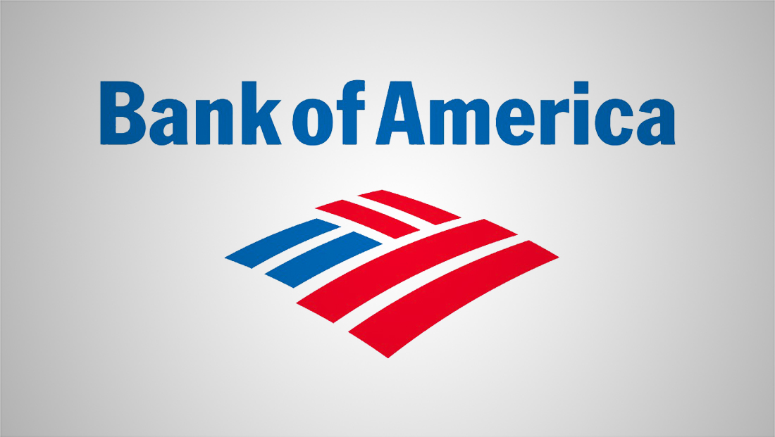
Bank of America redesigns logo, switches fonts
By MixDex Article may include affiliate links

For the first time since 1998, Bank of America has a new logo design — though the new look draws on the old.
- The bank, which introduced its “flagscape” icon in 1998, has retained the glyph but in a refined version.
- The new version features more space between the lines, which are meant to convey the basic structure of the American flag with an abstract interpretation of the lines in fields (a possible reference to “amber waves of grain”).
- In addition to the update to the icon, the red and blue shades has been shifted to darker, more sophisticated shades.
- In addition, Bank of America’s new look no longer uses Franklin Gothic.
- Instead a font that appears to be similar to Elisar DT Infant is now used in an all caps design.
- In addition to the new logo, the bank will launch a new campaign around the question “What would you like the power to do?”
- The new logo is being rolled out at the corporate level in 2018, with consumer facing updates slated for 2019.


