One ‘Chicago’ shows make typographic switch
By MixDex Article may include affiliate links
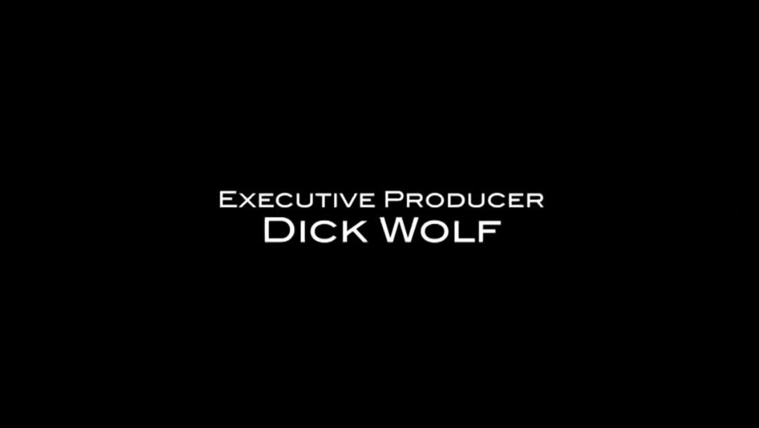
NBC made a small but typographically symbolic change to Dick Wolf’s “executive producer” credit card at the end of “Chicago Fire,” “Chicago Med” and “Chicago P.D.”
- The shows previously showed Wolf’s name set against a black screen in a typeface matching the show’s respective end credits, as shown in the “Chicago Med” example above.
- For the 2018-2019 season, all three shows switched to using the same executive producer card, set in Friz Quadrata.
- Friz Quadrata is known by some as “the Law & Order” font since it is used as the logotype since the original, now canceled series debuted in 1990 — and all of its spinoffs including the only one still on the air, “Law & Order: SVU.”
- The font is also used in the shows’ opening credits and the famous “locator lines.”
