Slack gets new logo design
By MixDex Article may include affiliate links

Team communication tool Slack has a new logo design — and people have mixed feelings about it.
- The company, which provides realtime messaging services for teams, is popular among startups and establish businesses.
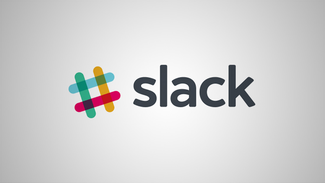
- Slack’s previous logo was a colorful take on the hashtag symbol that is popular both online and within the Slack service itself.
- The old hashtag icon design had four lines, each in a different color, that overlapped to form a hashtag.
- Thanks to the use of transparency, the intersection of each line created another color.
![]()
- Slack also had an alternative design that it used when a more compact design was need — namely for its mobile app icons.
- This design sort of “zoomed in” on the center, negative space in the center of the hashtag and placed an “S” in the whitespace.
- Along with the hashtag symbol, the company used an all lowercase logotype with slightly rounded corners to create a friendly, casual look.

- The new logo, meanwhile, keeps many of the same colors of the old one, but moves to a more abstract interpretation of a hashtag made of pill-shaped rounded rectangles and tear-drop shapes.
- The new logo was designed by Pentagram, and is meant to convey imagery of speech bubbles.
- The tilt of the logo is gone — and the logotype has been switched to a heavier, slightly bolder font that’s still in all lowercase letters.
- The new brand identify appears to keep the services familiar deep violet background in some cases.
- Slack’s new logo has gotten mixed reaction online, with some noting that it looks like a “swastika made of penises.”
- Slack, meanwhile, said it redesigned its logo because the old one was “simply awful.”
- It’s worth noting that one driving force behind dropping the hashtag inspired logo design is that the company could have faced legal challenges trying to enforce any trademarks or other intellectual property claims to a design based on a widely used symbol.

