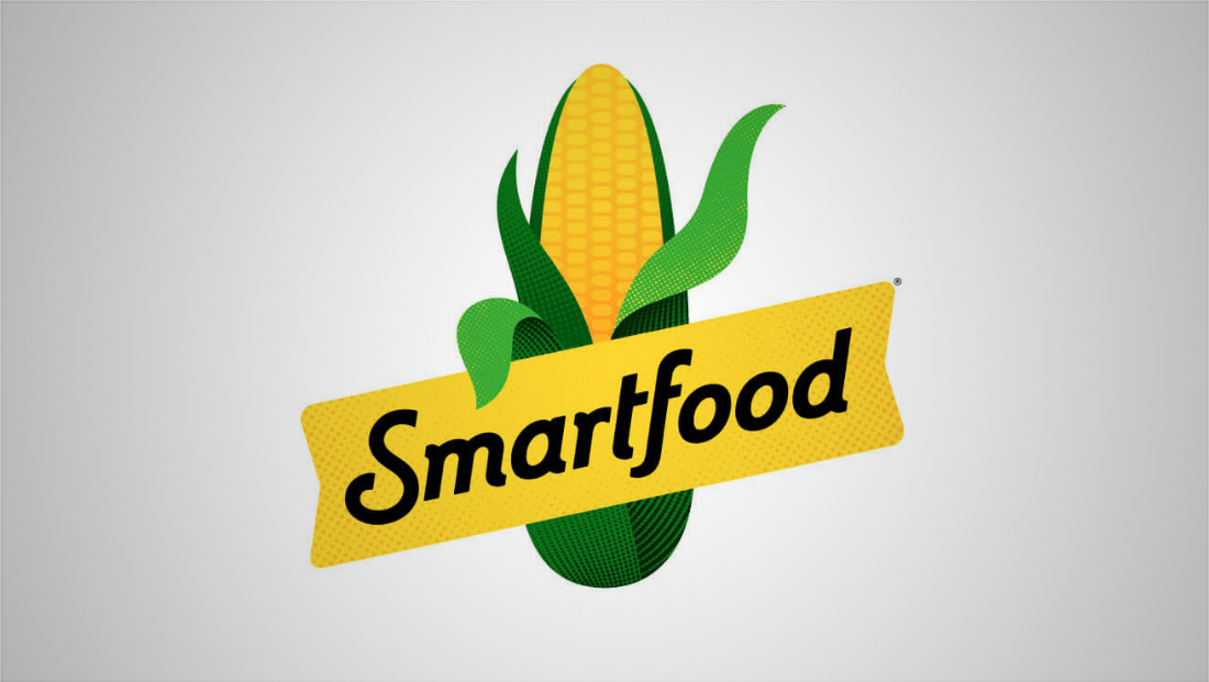
Smartfood popcorn gets new logo design
By MixDex Article may include affiliate links

Frito-Lay’s Smartfood popcorn brand introduced a new logo in the summer of 2019.

- The brand has updated its rather dated brush-style logotype to a more refined but simple script.
- The new logotype enhances the distinctive “S” and “f” in the old look that help make the logo easier to read as two separate words.
- The ear of corn in the background has been simplified as well to be less of an illustration and more of an icon or emoji look.
- It also has two ears of husks that make it seem like a welcoming person — one “hand” holding the yellow banner the logotype sits in and the other “waving” to the viewer.

