A look at the D.C. Redskins’ new name, logo design as the Washington Commanders
By MixDex Article may include affiliate links
After much anticipation, secrecy and speculation over suspected leaks, the Washington, D.C. NFL team has unveiled its new name and logo.
The team formerly known as the Washington Redskins will now be known as the Washington Commanders.
For the past two seasons, the team was known as the “Washington Football Team” after it dropped the redskins name over controversy because the name is often considered offensive to many Native Americans. “Redskin” is often a derogatory or stereotypical name for those of Native America or indigenous descent.
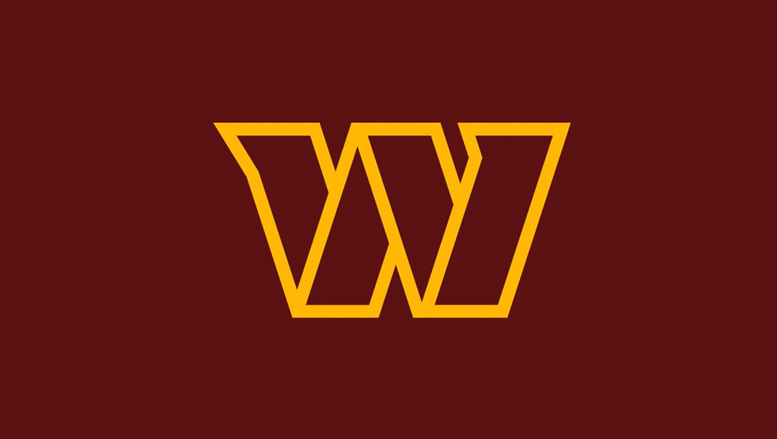
The new team logo is a stylized “W” created using four distinct outlined shapes that create a sort of “flat” ribbon-like interpretation of the letter.
While the middle “peak” of the icon is fairly standard, the left and right ascenders are capped with a distinctive “tail” or “notch” that faces left. These elements not only give the design a bit of uniqueness, but also suggest movement or, to some, the head of a bald eagle, a symbol of American democracy, similar to the concept used in American Airlines’ logo.
The icon can be both set against a burgundy background with gold strokes or be surrounded by white with the same gold outline and burgundy fill.
By itself, the logo perhaps isn’t the clearest representation of the letter “W” and some have noted they thought it was some kind of combination of the “N” and “W.”

Like many pro sports teams and companies, there is an alternate version of the logo that uses the “Commanders” name with a thick line above and below.
This logotype style design uses a bold, condensed typeface that’s been modified with a distinct “C” and “S” (the first and last letters of the design) to gain angled tips, a similar motif that’s found in the “W” icon.
The logotype has the option of having the word “Washington” perched above set in an extended width and spaced out sans serif.
![]()
The team also has a circular lockup of the logo that includes the logotype in the middle, but without the “Washington” on top. In the ring around it, the “Washington Football” name lives on, which the interior of the circle features four quadrants.
The upper left features “Est 19” as a reference to the team’s establishment date of 1932, with the “32” part appearing in the lower right. These two segments are white with burgundy lettering.
The upper right and lower left ones are reversed with a burgundy background and white symbols, with the “W” icon above and three stars below. The lower portion of the ring features the team’s five championship years separated by a bullet.
The 1932 founding date references the team’s original hometown and name, the Boston Braves, a name that lasted only one year before switching to the Boston Redskins. The franchise moved to D.C. in 1937, becoming the Washington Redskins.
It kept that name until 2019 when the name was retired over concerns of being insensitive to the Native American community.
The team has retained is burgundy and gold color scheme, with white and black mixed in as well, including on the updated uniforms, which feature numbers that, like the “W” icon, are segmented, creating a sort of “stencil” look.
It’s not uncommon for pro teams to use a letter icon as a branding element or logo and it often doesn’t use the same letter as the team name, but rather the first letter of its home city. For example, MLB team the Boston Red Sox frequently uses a custom drawn “B” as its logo and NFL team the Chicago Bears uses a stylized “C” for its logo.
Both teams also have alternative logos as well. In some ways, using the city initialism (as opposed to the team name or mascot’s) helps the team cover both its hometown and official name across branding opportunities.
“Commanders” was selected both for its bold sound but also in reference to the team’s location near the seat of power for the U.S. and military.
The president of the United States has the title of “commander in chief” and “commander” and “command” are used frequently in military jargon.
The D.C. metro area already has an arena football team called the “Commandos.”
The “Commanders” name has a “strong sounding” ring to it — a common trait with sports team names.
Team names often either use an animal (eagles, colts or rams, for example), inanimate object (thunder or jazz, for instance) or a more general name such as “raiders” or “titans” that convey a general sense of pride or strength.
Other teams get their names from local references, such as the Pittsburgh Steelers, which takes it name from the city’s once booming steel industry (this name also has the advantage of being pronounced as “stealers” as in someone who “steals” the ball frequently).
In some cases, when franchises move cities, the name may have ties to a past locale but doesn’t necessarily make sense in the new location. There’s also teams that use more general terms (similar to “commanders”) such as the New England Patriots, which is a reference to the region’s historic role in the American Revolution.
Online, the team managed to buy the domain commanders.com and get the @commanders handle on many major social media platforms. It previously used washingtonfootball.com along with @washingtonnfl.
The team did not announce any character mascot. Many sports teams have a mascot that appears in some iterations of the logo (such as the Bears). Others don’t have an official mascot.
In some cases, the mascot may also be represented by a costumed person or animal who makes appearances at games and other events — such as the Philadelphia Eagles’ Swoop the bald eagle.
Some team mascots, however take a different route, such as the Philadelphia MLB team’s use of the Phillie Phanatic, a green amorphous creature — since it’s hard to define what, exactly, a “Philly” is in terms of a character.
Many teams with Native American references have mascots that involve dressing in what is interpreted as traditional Native American garb, but more often than not is more stereotypical and historically inaccurate. There has been a growing movement among teams ranging from local community leagues to high schools to professional sports to eliminate these mascots and team names and the Washington Redskins name change is perhaps one of the most prominent examples and rebranding efforts.