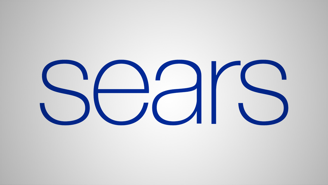
A look back at Sears logo design history
By MixDex Article may include affiliate links

With Sears announcing the end of the company’s 146 year run in American retail, here’s a look back a the company’s logo design.

Like many companies at the time, Sears didn’t rely so much on a logo back when this 1907 ‘letterhead’ was designed, but instead relied on what typography was available in cold and, later, hot type presses. On recurring theme during Sears’ early years was the use of the Search, Roebuck and Co. name.

From 1963–84, the company used this boxed in logo, which obviously also shortened the name to just “Sears.”

From 1984–94, the store laid the foundation for what would probably become its most well known logo design.The new design featured bold, all caps letters with “lines” drawn insider of each stroke. The effect was sort of a cross between neon and some other logos at the time, including CNN.

The general style of the logo was retained in a 1994 redesign, though the lines inside of letters were refined a bit.

Somewhere along the line, along with that whole ‘come see the softer side of Sears’ campaign, someone thought that changing the logo to title case would help, well, soften, the logo. While the logo wasn’t quite as ‘soft’ as it could be, given the thick lettering, the design latest from 2004-2010 in the U.S.

Finally, Sears decided to go really sift and switched to an all lowercase, lighting and air sans serif with thin letterforms.

