‘American Horror Story: 1984’ veers away from longtime logo design
By MixDex Article may include affiliate links

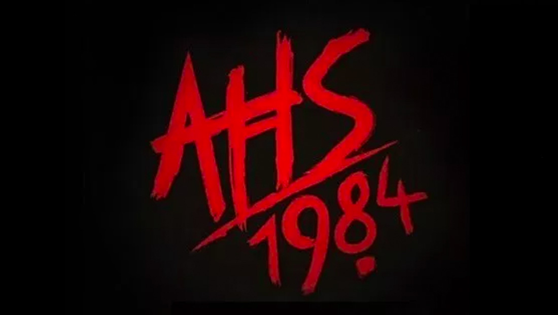
“American Horror Story: 1984,” the ninth season of the anthology on FX, is the first in the show’s run to veer away from using the arts-and-crafts style logotype.
- “1984,” described as a slasher movie theme, uses scrawled handwriting along with the “AHS” abbreviation of the show’s title.
- For the show’s previous eight seasons, the show used variations of logo designs that used the font Willow as its primary logo design.
- Although the key art and exact logo designs for each season varied, Willow has remained a consistent graphic design element of the show.


