Breaking down Sesame Street’s 50th anniversary logo
By MixDex Article may include affiliate links

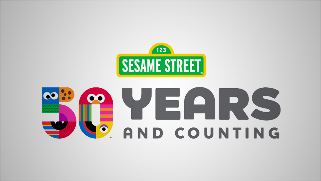
“Sesame Street” is celebrating its 50th anniversary in 2019 with a special logo that is an amalgamation of references to some of its most iconic characters.
- The design comes in several variations, including a horizontal lockup with the show’s street-sign style logo and the “50” icon next to “50 Years and Counting” text.
- The “50” icon, meanwhile, uses faces and elements from some of its most iconic characters that are done in a geometric, flat style.
- The patterns include, as best we could figure:
- A blue set of eyes that are meant to be Cookie Monster.
- A chocolate chip cookie pattern, another reference to Cookie Monster.
- A green zig-zag pattern that is a reference to Oscar the Grouch — though it could also be seen as a nod to Kermit the Frog.
- A curved pink and violet shape likely meant to reference Abby Cadabby.
- A red wavy texture that could represent either Murray Monster or the red alien.
- A black half circle with a set of “fangs” representing The Count von Count.
- The red, yellow and white stripes on Ernie’s shirt.
- A red half circle with eyes and orange nose to represent Elmo.
- The vertical orange, blue and green pattern on Bert’s shirt.
- The pink and orange stripes could represent Slimey the worm, Julia, Mr. Snuffleupagus, Telly Monster or Zoe Ballerina. None of these characters sport a pattern in that exact pattern or shades, however.
- A blue, red and black quarter circle that appears to be a reference to Grover’s mouth.
- Finally, an eye surrounded by yellow is a nod to Big Bird.
- It’s worth noting that some of the designs may have multiple meanings on purpose.
![]()

