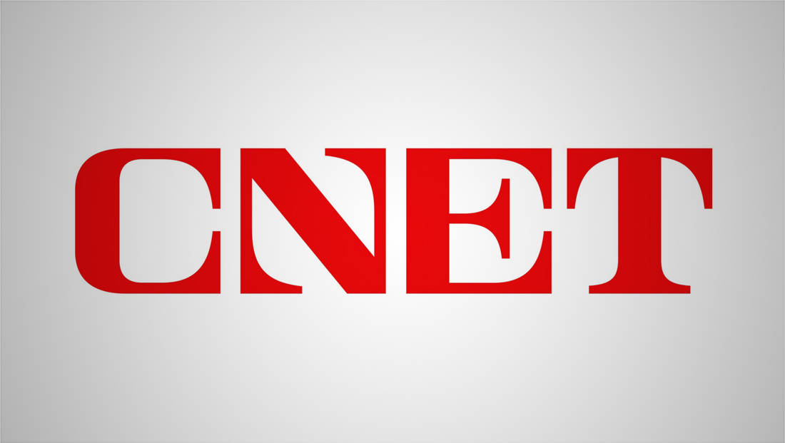
CNET gets distinctive new logo, rebranding
By Michael P. Hill Article may include affiliate links

CNET, a media company focused on technology and consumer electronics, has unveiled a daring new logo and branding that boldly claims itself as a “guide to a better future.”
The company, which traces its roots back to 1994, unveiled its new look April 27, 2022.
“The needs of our audience will always be our north star,” says Lindsey Turrentine, EVP content strategy at CNET in a statement. “This brand evolution is the culmination of years of work toward what we’ve always aspired to do: help our audiences navigate a rapidly changing world in ways that specifically make their lives better no matter where they connect with CNET.”
The updated also included a new tagline, “Your guide to a better future.”

The company dropped its longtime logotype featuring the words “CNET” in lowercase letters set in a “techie” font and with a distinctive vertical pipe glyph separating “C” from “NET.”
It did keep the trademark red color, which has also been used as a circular container for the logotype over the years, but switched to a custom drawn all caps logo.
The typeface features letters that each fill out a roughly square footprint with exaggerated serifs, including two distinct inward facing ones on the “N.”
It’s not entirely clear what the inspiration for the lettering was. Other than mentions of “every corner of the business” and “(helping) their audience navigate” in the press release announcing the rebrand, there’s no direct explanation for the squared-off shapes and distinctive “points.”
That said, the reference to “north star” in Turrentine’s statement could indicate why the “N” is so distinctive and why the other letters feature such strong horizontal (east-west) and vertical (north-south) elements.
Some social media users have compared the logo to having a stereotypical Russian-look to it (some even noting how, ironically, “CNET” sounds a bit like “nyet,” which is Russian for “no”).
The “N” has also caught the eye of many on social media, with some noting it looks more like a “Z” turned on its side.

Still others have noted similarities between the new CNET “N” and Apple News icon, though the latter is formed from three entirely disparate shapes.
CNET worked with the agency Collins to develop its new look. Original artwork from illustrator Robert Beatty is used as well.
“In a hyper-changing world, people need useful information, not every bit of it,” reads a brief mention of the project on the Collins website. “We were honored to work closely with the editors and publishers at CNET to craft a new brand strategy, story and identity that transforms them from a tech-review site into an editorial-first brand people trust for its shockingly useful news and advice as much as its journalism expertise.”
The company notes that a full case study is coming soon.
Either way, the logo does manage to become a standout design and perhaps purposefully toes the line between design approaches.
All of the CNET websites have been redesigned to incorporate the new logo along with the popular serif Sentinel as a headline font, a move that appears to be part of the trend of using bold, distinctive typography.
Meanwhile, sans serif Monument Grotesk steps in as body copy.
In some applications, the logo’s blocky letterforms are driven home with a 3D rotating animation effect that introduces each letter separately almost as if they are on rotating blocks. This is used in select website headers as well as motion graphics in video content.

