Trello gets new logo design that puts it more in line with its corporate parent, sister products
By MixDex Article may include affiliate links

Popular project management and productivity tool Trello has a new logo design.
The service, which is owned by Atlassian, released a new look Feb. 16, 2021, that also coincides with a major project expansion.

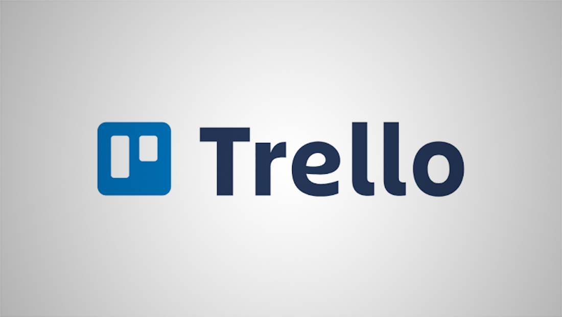
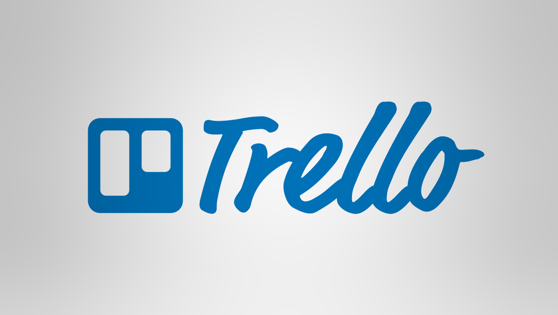
The new logo (thankfully) ditches the brush style logotype and appears to adopt a customized version of the font Charlie, which Atlassian also uses for its branding.
Like Atlassian, the logotype was tweaked to add distinct features. Like the distinct crossbar of the capital “A”s in the parent logo, Trello has a more organic “loop” in its “e,” which gives it a distinct friendly feel.
The company also tweaked its icon, which is meant as a super simple rendition of its lists and cards. The changes appear to help marry the design system of Atlassian and its other products, which include Jira, Bitbucker and Confluence.
Now, the negative blocks meant to represent these parts of the products main GUI are narrowed, making the “borders” around each one thicker, which creates a better balance between the widths of these and the square footprint the icon occupies.
Some applications of the new Trello logo icon are more in line with the brighter blue with gradient accents of its corporate cousins, while others stick with the previous logo’s slightly more subdued hue.
While there are monochrome versions of the new logo, the “full” version of the logo eliminates the practice of displaying the icon and typography in the same color.

