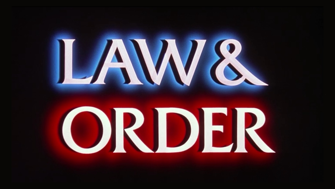
What font does ‘Law & Order’ use?
By MixDex Article may include affiliate links

All of the “Law & Order” franchises have used the font Friz Quadrata for their logo design, title cards, opening credits and more.
- The font, which features thick, strokes likely inspired by stone carving is a good fit for a show that takes place within the halls of justice — including police stations and courthouses.
- The original “Law & Order” broadcast began the traditional of use the font as its logo and title card.
- The font is also used in all of the franchise’s opening credits that showcase still photos of series regulars as well as the on-screen credits that appear at the start of each episode.
- The font is also used for the show’s iconic “locator lines” that are used to explain when the show switches to a new venue or time (these cards are accompanies by a “ching ching” sound effect after a significant amount of time has passed.”
- Canceled spinoffs “Law & Order: Criminal Intent,” which aired on USA Network, and NBC’s “Law & Order LA” also used the same font. It continues to be used in “Law & Order: SVU” that are still in the air as of the 2018-2019 season.
- “Law & Order” is executive produced by Dick Wolf, who also produces “Chicago Med,” “Chicago PD” and “Chicago Fire” for NBC. For the 2018 season, all three shows switched to using a closing EP credit card that is set in Friz Quadrata.

