Karen, ‘The Rachel’ or the Grinch: What do you think Paris’ 2024 Olympics logo looks like?
By MixDex Article may include affiliate links

Since it was unveiled in 2019, the 2024 Summer Olympics logo created by host city Paris’ organizing committee has attracted attention — and now it’s back in the spotlight as the 2022 Winter Olympics end and the world looks ahead to the next Games.
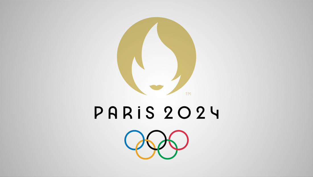
The logo features a gold circle with a flame “cut out” of it using negative space. There’s also a small accent near the bottom of that that could be interpreted as both a pair of lips or mustache (or perhaps other things as well).
Even back in 2019, the logo was compared to a human face — whether it be Rachel Green from “Friends” and her iconic haircut, or everyone’s favorite woman, “Karen,” who would rise to even more infamy in the disaster that was 2020, 2021, 2022 and possibly beyond.
Paris dice que su logo oficial de los Juegos Olímpicos es “Marianne”, que representa a todas las mujeres.
Pero los verdaderos conocedores sabemos que es Jennifer Aniston en los 90s. pic.twitter.com/xNKQrhG5pR
— Eduardo Rodriguez (@_privatelawyer) October 22, 2019
Twitter was full of comments about the logo design when it was released.
Why does the Paris 2024 Olympics logo look like it drives an Audi TT, complains to every manager it sees and is named Karen!? #Paris2024 https://t.co/Fo4fC24Aej
— Andrew (@lavery_andrew) October 22, 2019
Other interpretations have included Dr. Seuss’s the Grinch and comparisons to the Tinder logo.

Back when Paris was just a candidate city bidding for the Games, it used a colorful ribbon style glyph that was suggestive of the number “24,” the famous Eiffel Tower and the concept of movement and sport in general.
The design was creative, but perhaps a bit clunky and might also not read well at smaller sizes.
However, it’s not uncommon for the candidate logo to get replaced with another design once the Games are awarded to a city.
In addition, while the Paris organizing committee’s logo will likely be seen throughout venues come 2024, it’s also not uncommon for broadcasters with rights to the Olympics to create their own unique designs. This is especially true with U.S. rights holder NBC.
In the past, NBC has typically used a more generic mountain motif for Winter Olympics, while Summer Olympics get a look that’s more suggestive of the host city or country.

Starting with Rio de Janeiro in 2016, however, the look went from direct references to iconic landscapes and architecture to a more abstract interpretation (that year it was nicknamed “the pebble”) and custom drawn typography.

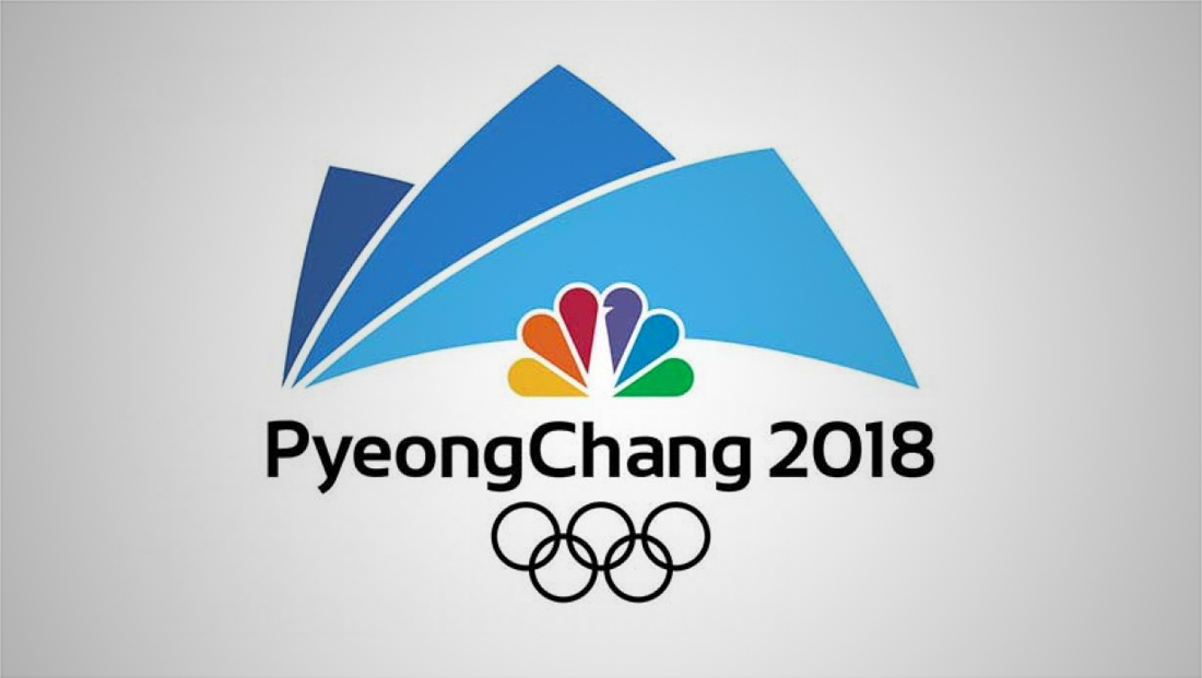
That continued with the “sail” like mountains for PyeongChang, South Korea, in 2018.

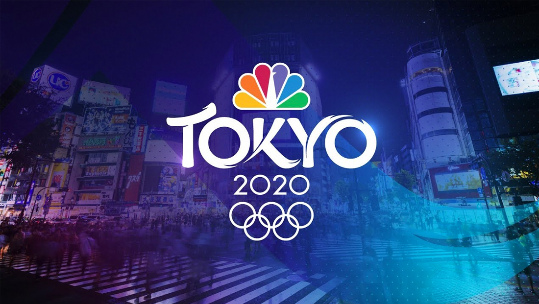
NBC’s coverage of the delayed 2020 games eliminated a separate icon altogether and let the typography, along with the NBC peacock and Olympic rings, head up its branding.

NBC’s 2022 Beijing logo design combined both distinctive typography with an icon.
NBC has not unveiled its design for its coverage of the 2024 Paris Games as of Feb. 21, 2022.
Popular Searches
- TV Industry News
- Broadcast Engineering News
- Broadcast Design News
- TV Talk Shows
- TV Syndication
- TV Advertising
- TV News Jobs
- TV Industry Mergers and Acquisitions
- TV Anchors
- Cable News
- Late Night TV
- TV Syndication News
- Broadcast Industry News
- TV News Drone Journalism
- TV News Augmented Reality
- TV Weather Forecasting
- TV News Journalism
- TV News Ethics
- OTT News
- News About NBC
- News About CBS
- News About ABC
- News About CNN
- News About MSNBC
- News About Fox News

