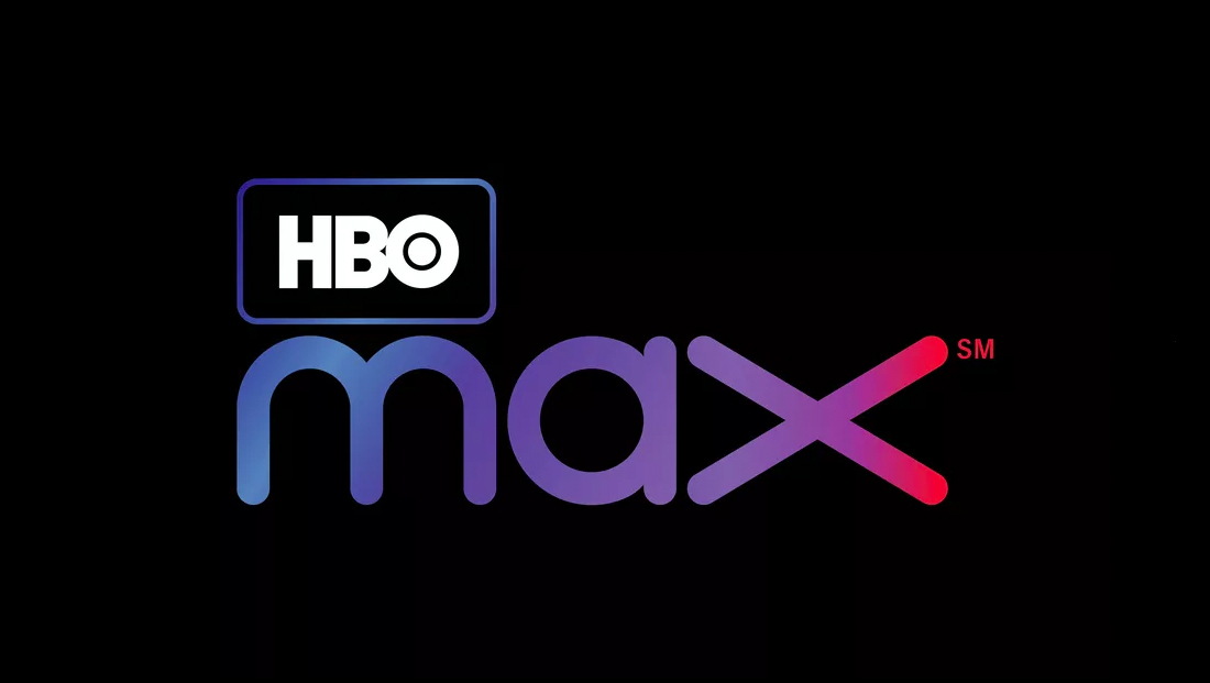
HBO Max logo design
By MixDex Article may include affiliate links

With WarnerMedia settling on “HBO Max” as the name for its streaming service, a new logo design was also released.
- The lockup features the longtime HBO logo in the upper left inside of a rectangular outline with rounded corners.
- The word “Max” is spelled out below in a curvy font.
- The letters are filled in with a blue to red gradient.
- This gradient is also carried through in the outline around the HBO logo, but not the logo itself.
- The design also features an exaggerated “X” at the end of the design that’s about one and a half times as wide as the other letters.
- In some ways, the curves in the word “Max” including the “a” mirror the heavier HBO logo.
- However, the design also ignores some of the stronger elements of the HBO logo, including the large dot in the “O” and bold strokes.

