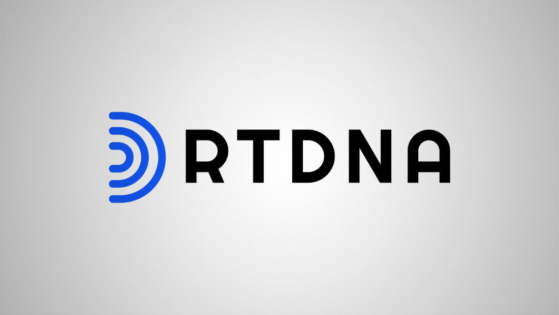
Radio Television Digital News Association unveils new logo design
By MixDex Article may include affiliate links

RTDNA has unveiled a new logo design.
The organization, whose acronym is short for Radio Television Digital News Association, introduced a new design that features the letters set in a rounded typeface with distinctive “R” and “A.”
The look also includes a three “signal wave” that could also read as a “D” to the left.
The design is meant to “evoke the symbols of traditional broadcast and reflect modern digital technologies, representing the industry’s and organizations’ evolution and creating a sense of forward movement,” according to a statement.
The organization also released a new brand standards guide.
Prior to changing its in 2010, the organization was known as the Radio Television News Directors Association, or RTNDA, meaning its new name flipped the position of the “N” and “D” but also changed its meaning significantly to encompass a broader scope and membership.
Popular Searches
- TV Industry News
- Broadcast Engineering News
- Broadcast Design News
- TV Talk Shows
- TV Syndication
- TV Advertising
- TV News Jobs
- TV Industry Mergers and Acquisitions
- TV Anchors
- Cable News
- Late Night TV
- TV Syndication News
- Broadcast Industry News
- TV News Drone Journalism
- TV News Augmented Reality
- TV Weather Forecasting
- TV News Journalism
- TV News Ethics
- OTT News
- News About NBC
- News About CBS
- News About ABC
- News About CNN
- News About MSNBC
- News About Fox News

