NBC creates eye-catching visuals for ‘One Chicago’ night
By MixDex Article may include affiliate links
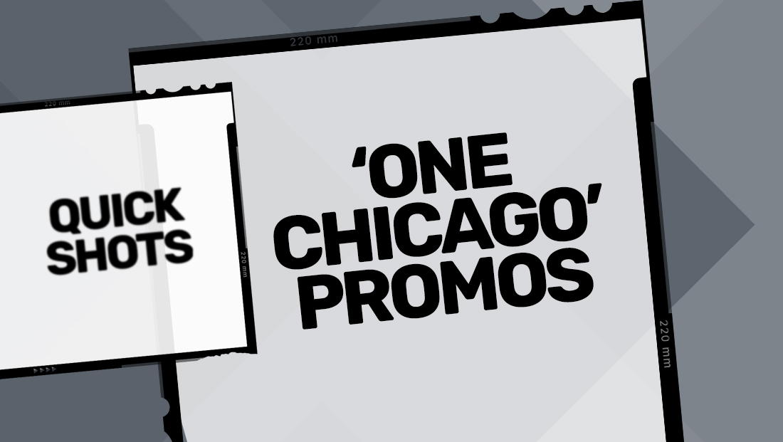
With NBC moving “Chicago Fire,” “Chicago Med” and “Chicago P.D.” all to Wednesday night — covering the network’s entire primetime block — the network is actively promoting the night as “One Chicago.”
- So far, each show’s social media accounts have posted three eye-catching graphics promoting the big night.

- The first features a bold red header with outline of the Chicago cityscape, while the bottom portion is divided into three sections.
- “Med,” “Fire” and “P.D.” are promoted, from left to right (which represents the order the shows will air).
- All three segments include dramatically cropped black and white photos of each show’s main cast.
- Each cast member has a slight “side light” effect added — red for “Med” (presumably a reference to the ubiquitous emergency room color), orange for “Fire” (a reference to flames) and blue for “P.D.” (a reference the color often associated with police officers).
- Each show’s name (sans “Chicago”) is rendered in its logotype font.

- Another, gritty images features the words “One Month” in bold letters along with imagery of the city and iconic elevated train tracks and six pointed stars from the city flag. On the side, “One” is placed in a box above the word “Chicago” with “Med,” “Fire” and “P.D.” listed below.

- More recently, a light blue image is used, also featuring a view of the city.
- The left side, above the city, features the premiere date prominently along with a “One Chicago” logotype. The right side features each show’s logotype with airtimes.
- You can go behind the scenes of all three shows here.
Popular Searches
- TV Industry News
- Broadcast Engineering News
- Broadcast Design News
- TV Talk Shows
- TV Syndication
- TV Advertising
- TV News Jobs
- TV Industry Mergers and Acquisitions
- TV Anchors
- Cable News
- Late Night TV
- TV Syndication News
- Broadcast Industry News
- TV News Drone Journalism
- TV News Augmented Reality
- TV Weather Forecasting
- TV News Journalism
- TV News Ethics
- OTT News
- News About NBC
- News About CBS
- News About ABC
- News About CNN
- News About MSNBC
- News About Fox News